From first prototype to MVP
Designing a product that takes the paperwork out of every appointment, keeping each screen lean while leaving room for what practices would ask for next.
At a glance
- Situation
- A new product with an AI-native engineering team that could build almost anything quickly. The risk wasn't building too slowly; it was building too much: an overwhelmed user might not give clear feedback on value.
- Task
- As founding designer, design the smallest product that took patient paperwork off the front desk from end to end. Iterate until it landed as a product that design partners would actually adopt.
- Action
- Designed one loop first, from booking to filed form, then made a handful of structural choices that kept every screen simple and left room to grow. Brought features back when partners showed us why.
- Result
- A full MVP in four months, against an engineering estimate of about 18 by traditional development. Five practice management integrations live, and 90% of onboarded design partners converting to paying customers.
When building is cheap, curating features is the work
Our engineers and I worked alongside AI agents, and could turn a design into working software in days. That speed is a gift and a trap. Every idea a practice mentioned could become a feature by Friday, and a product built that way ends up with twenty settings for every one a front desk actually needs.
Practices didn't want more software. They wanted fewer phone calls, fewer half-finished forms, and less retyping.
One loop, end to end, that partners would adopt
Design the smallest product that took a practice's paperwork from booking to filed record without anyone chasing it, and that design partners could set up and use in their first week. Keep it simple enough to adopt, and structured so the next features had somewhere to go.
A few structural choices, made early
Product framed each need as "we need something that does this, and it can't do that, because of this constraint." Much of what the product needed to do came from the partner research; the constraints, mostly from the practice management systems, came from product. The interaction design and the UI frameworks were mine. Most of the product's simplicity came from a handful of decisions about structure, not from styling.
Build the thinnest loop first
The first slice was the bare minimum to get from end to end, in the order a practice would meet it:
- SettingsCreate an account and connect the practice management system.
- Forms and filesA list of ready-made documents to send to patients.
- Send a taskAssign a document to a patient straight away.
- TasksSee every task and its status as patients send them back.
- ReviewAccept what a patient submitted, and watch it write back to their file.
Building along that line let us test as we went, each step deeper into the journey. Once the loop worked, we brought in the form builder and the workflow builder, so practices could make their own forms and send them automatically whenever a matching appointment type appeared in their system.
Group tasks into touchpoints, not settings per form
For each appointment type, a practice sets up a workflow once. Its tasks sit in a few touchpoints (on booking, before the appointment, after it), each with one send time and one due time. A practice with four forms has three settings to think about, not twelve, and a patient with four forms gets one text and one link, not four.

A link, not an app
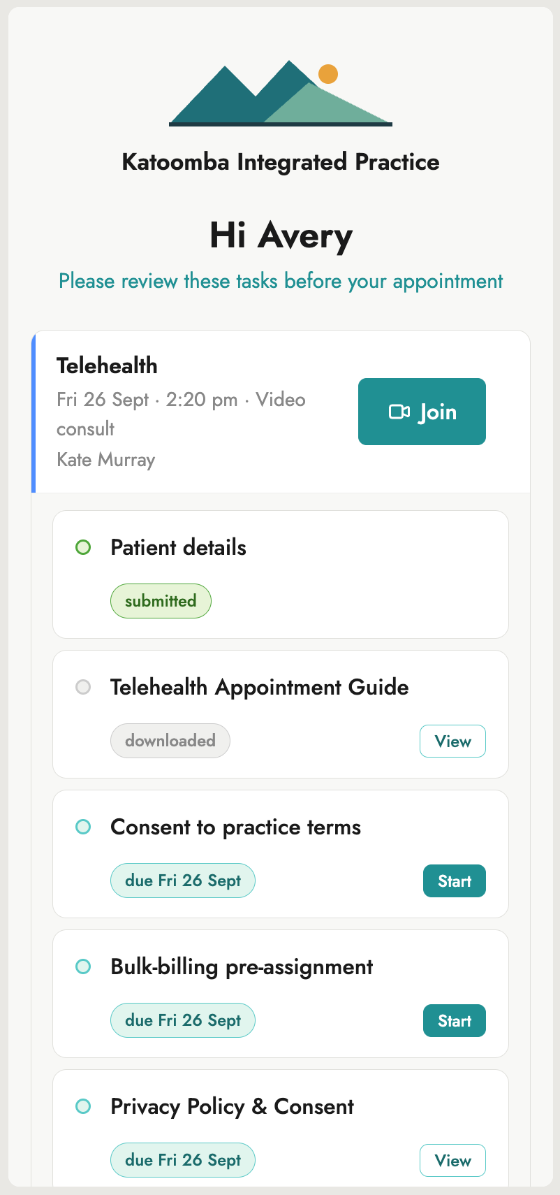
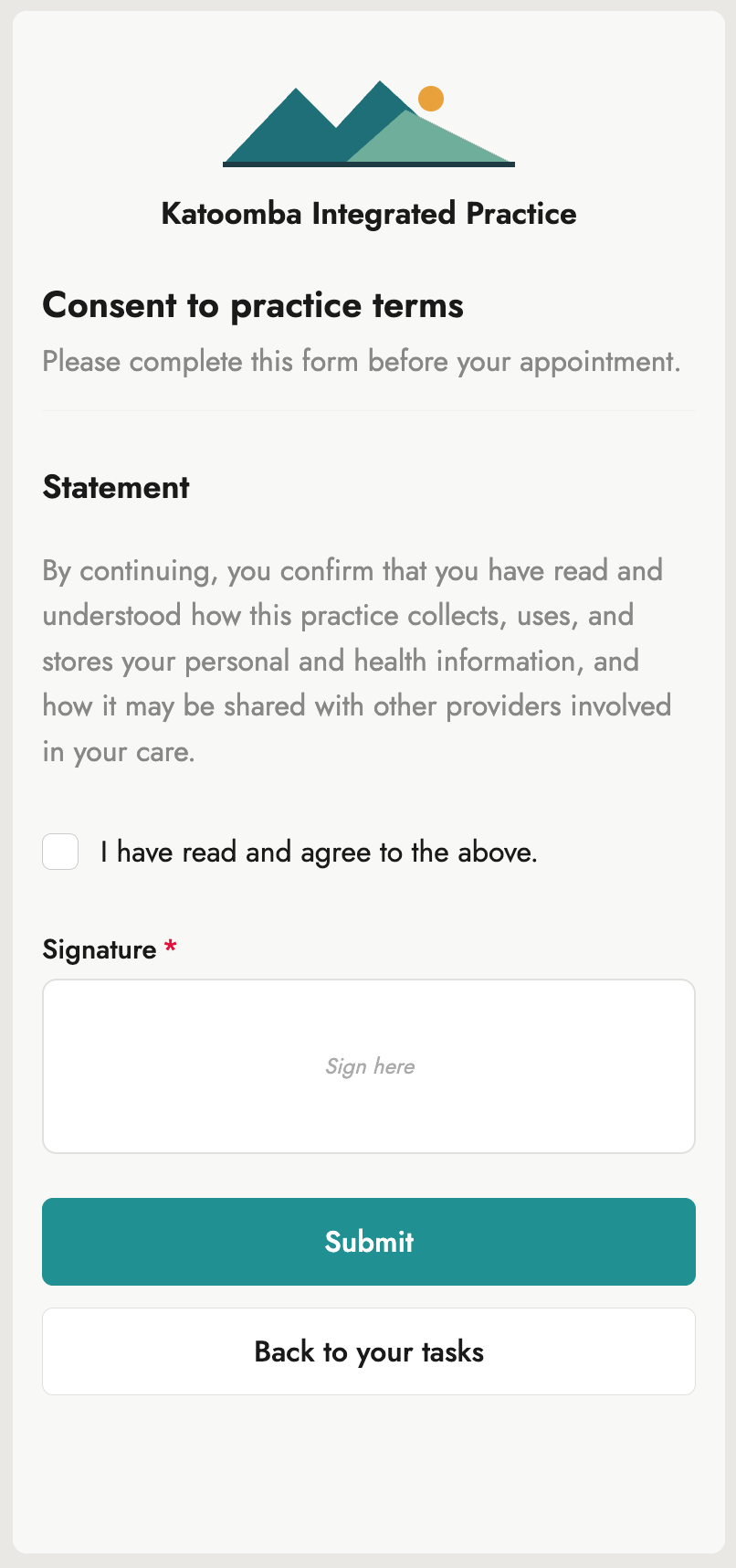
Patients get a text from their practice with one short link. No account, no password, nothing to install. The page lists what to do and what's already done, and for telehealth the Join button appears on the same page as the appointment approaches, so there's never a second link to find.
Putting every form in one place turned out to be one of the biggest wins. Patients could see all their homework at a glance, and what each piece needed. Over 80% of patients who started a form in the portal went on to finish all of them.
Patients open that link on whatever phone they have. I got my hands on some very old phones and reworked how the portal scales, then used Claude to simulate a BrowserStack-style pass across devices and browsers, so it held up wherever it was opened.
One board, sorted by what needs doing
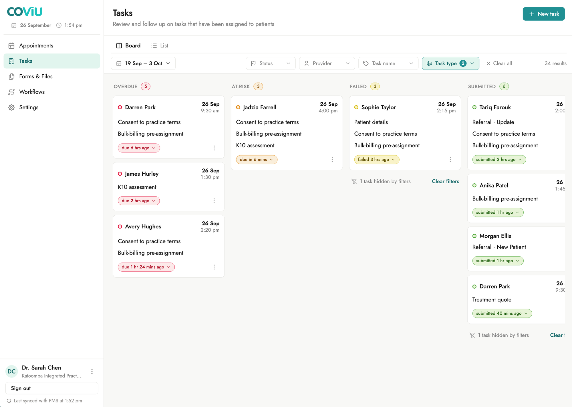
Every task for every patient sits on one board, in columns by state: overdue, at risk, failed to send, submitted, assigned. Each column carries a count, so the size of the day reads at a glance. A patient's tasks for the same appointment stack onto one card, so four outstanding forms are one decision, not four.
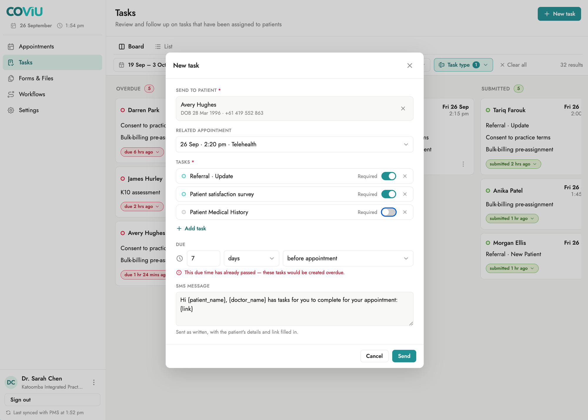
Anything a workflow doesn't cover can be sent by hand from the same screen: choose the patient and appointment, add the tasks, set when they're due, and check the message. If the due time has already passed, the panel says so before anything is sent.
The same day from any angle
Reception, practitioners and managers each look at the day differently. The same data shows as a board to triage, a list to work through, a runsheet of who's coming in, or one patient's profile before picking up the phone. One system, four views, no extra data.

Show what will change before writing it
Unless a form is set to accept automatically, nothing a patient submits goes into their record until someone at the practice has looked at it. The review shows every response, marks the fields that will be written straight back to the matching fields in the practice management system, and says in plain words what accepting will do: file the form as a PDF, with any file the patient uploaded, into their record. Rejecting sends the patient a new task, to try again.

Start from a library, never ask twice
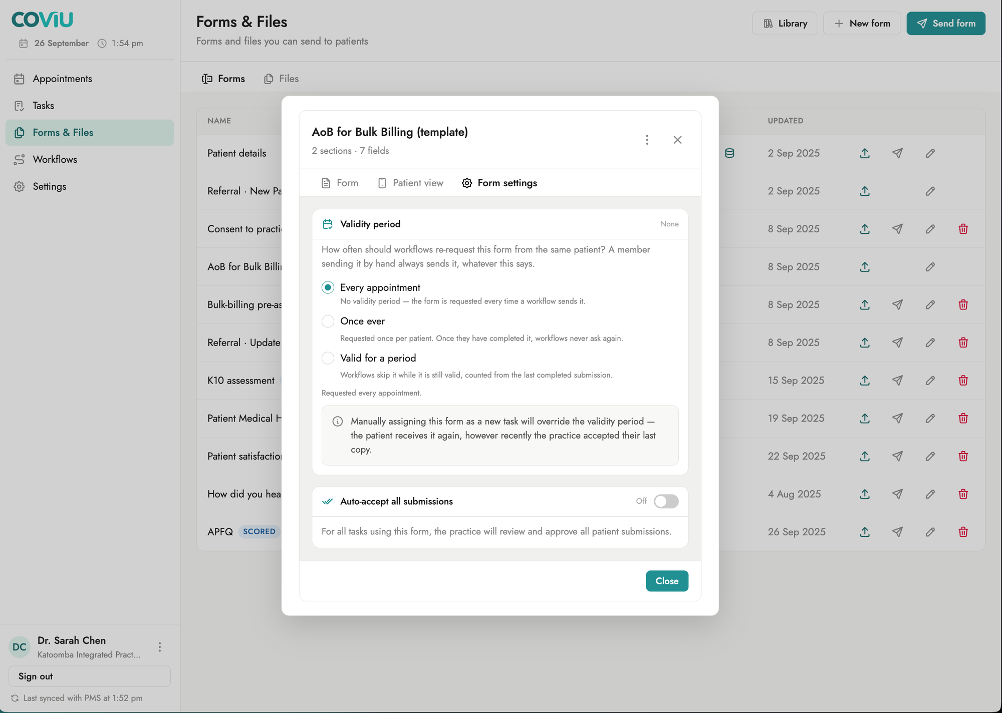
New practices start from a library of common forms and files, then edit or build their own from plain field types. A form can carry a validity period, so once a patient's consent is accepted, workflows stop re-asking until it lapses.
Come back for more when partners show why
Plenty was left out on purpose, with a place kept for it. When design partners showed us a real need, we came back:
- Email as well as SMS. Some practices preferred email for PDFs and for longer or more serious documents: for the formatting, for a record to keep, or for the weight the document deserved. One practice-wide preference with a fallback gave them both, rather than a setting on every workflow.
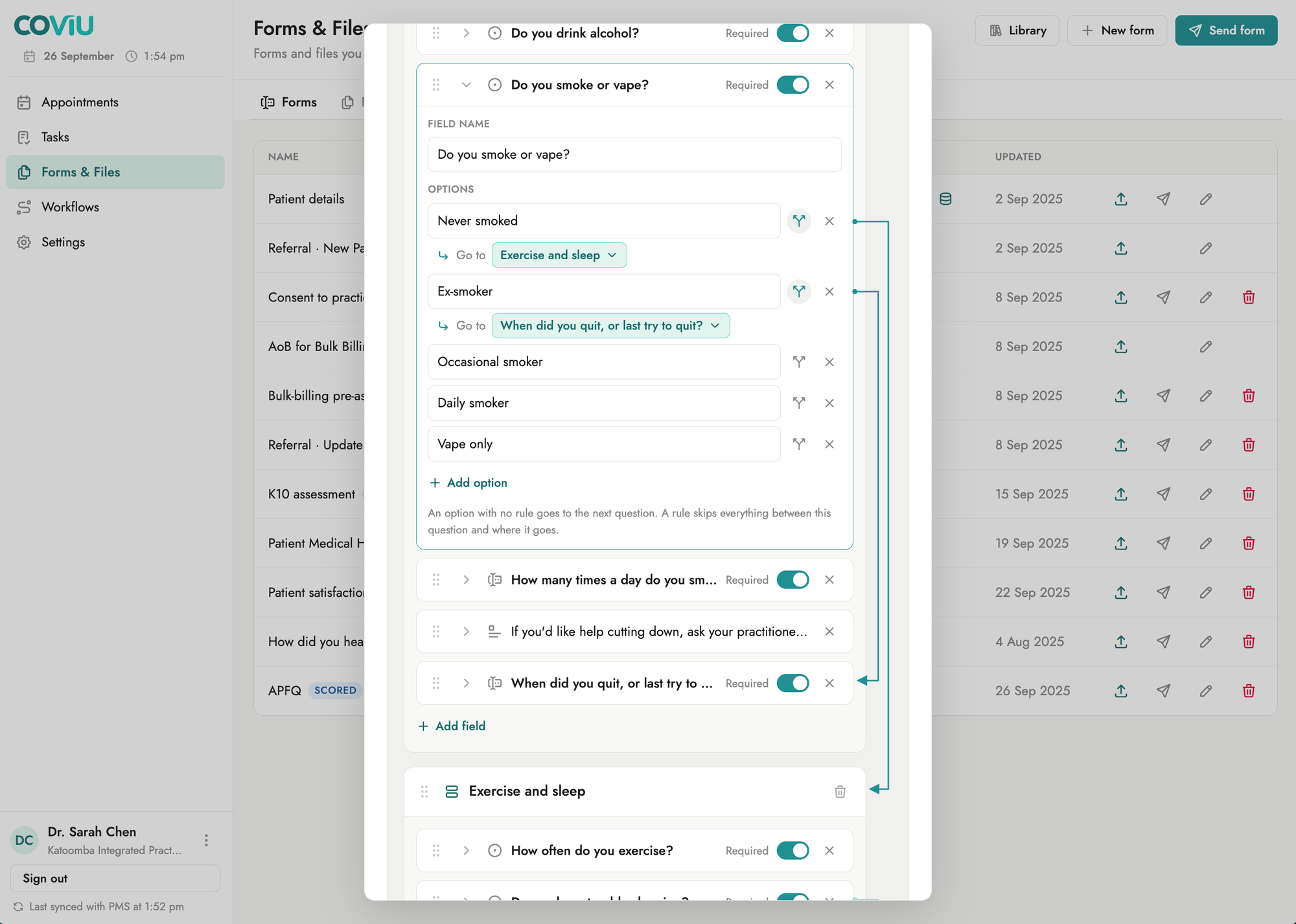
- Conditional forms. Patients are already answering personal questions about their bodies, often while stressed. They shouldn't also have to work out whether a question applies to them, so whole sections skip themselves, invisibly, when they don't.
- Referrals. A chicken-and-egg problem: a patient has no file in the practice management system until they have an appointment, but they need forms completed before they can have one. We solved part of it. A referred patient can exist in Coflow as a provisional patient, with the documents that qualify them for an appointment tracked like any other task.
- Files by link. Some practices had invested in explainer videos and wanted to show them off, and a link suits patients who take information in differently. A video or guide now goes out the same way as any file.
Shipped in four months, adopted by its first customers
- 4 monthsfrom first commit to a full MVP, against an engineering estimate of about 18 months by traditional methods.
- 5practice management systems integrated: Gentu, Cliniko, Halaxy, MediRecords and Nookal.
- 90%of onboarded design partners converted to paying customers.